UK Soap Audience Heatmaps

See UK soap storylines through audience data, not guesswork. Weekly heatmaps track sentiment, engagement spikes and narrative risk across Coronation Street, EastEnders, Emmerdale and more, turning social chatter and ratings trends into clear insight for writers, marketers and commissioners.

Making Sense Of Soap Fandom

We analyse UK soap audiences, blending social data and ratings to reveal which plots resonate, which divide opinion and how key characters are performing.

A large, ultra-modern OLED wall display in a darkened analytics studio shows a vivid heatmap of UK television soap audiences across a detailed map of the United Kingdom. Each region glows in gradients of red, amber, and cool blue, with crisp percentage labels and tiny channel logos for major UK networks. Surrounding the main map, sleek, floating panels display sentiment dials, engagement graphs, and narrative risk indicators in clean, minimalist UI. Subtle cool-toned LED strips illuminate the matte black walls and brushed metal desk surfaces. Photographic realism, shot from a slightly elevated wide angle with sharp focus, creating a professional, data-driven atmosphere that feels precise, high-tech, and authoritative.
A glossy, black glass conference table supports an open, high-end laptop displaying a full-screen dashboard of weekly UK soap opera audience analytics. The screen shows a multi-colored heatmap, structured sentiment charts, and risk trend lines arranged in a clean, modern interface. Around the laptop are neatly arranged printed reports with bold headings like “Sentiment Shift” and “Storyline Risk Index,” each page featuring precise graphs and color-coded tables. Cool, diffused office lighting from an overhead panel creates subtle reflections on the table’s surface and soft shadows beneath the documents. The background is intentionally blurred, hinting at a sophisticated media analytics office. Photographic realism, eye-level composition, professional and focused mood emphasizing clarity and insight.
A wall-sized, frameless glass panel in a contemporary media strategy room is covered with meticulously arranged printed heatmaps and charts tracking weekly UK TV soap performance. Each sheet shows colored intensity blocks, sentiment ratings, and narrative risk markers in a consistent, minimalist design palette of deep blues, warm ambers, and precise greys. Discreet magnetic clips hold the pages in clean rows and columns. Daylight from a nearby floor-to-ceiling window casts soft, natural illumination across the glass, creating faint reflections and gentle shadows of the paper edges on a pale concrete floor. Photographic realism, shot from a three-quarter angle with moderate depth of field, conveying a calm, analytical atmosphere and an orderly, professional workflow.

Services

A curved, ultra-wide monitor on a tidy, matte white desk displays side-by-side time-series graphs of engagement, sentiment, and narrative risk for the most-watched UK television soaps. Each line is sharply defined in distinct brand-like colors, with small, labeled peaks indicating key episodes and cliffhangers. Below, a synchronized timeline bar is segmented by episode titles and broadcast dates. To one side of the monitor sits a minimalist notebook open to a neatly sketched storyboard of soap plot arcs, drawn in fine black ink. Soft, cool studio lighting creates delicate highlights on the monitor’s bezel and subtle shadows under the notebook. Photographic realism, captured in a centered composition with shallow depth of field, projecting a focused, strategic, and highly organized mood.

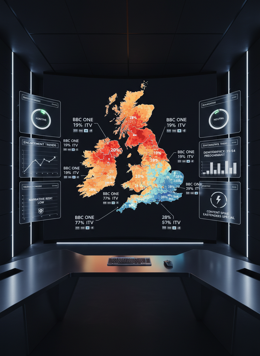
Weekly audience heatmaps visualise sentiment and engagement across every major UK soap, helping teams spot risks and breakout characters early.

A dark-mode analytics interface fills a high-resolution monitor, dedicated to a single UK soap opera’s narrative risk analysis. The central visualization is a grid-based heatmap episode timeline, where each cell represents a plotline segment, colored from calming teal to warning crimson based on calculated risk. On the right, slim vertical panels summarize character entanglement scores and unexpected sentiment drops with compact bar charts and icons. The UI has crisp typography, subtle neon accents, and precise spacing. The room is lit only by the monitor and a faint blue ambient glow from a hidden LED strip, casting gentle reflections across a charcoal desktop. Photographic realism, close-up, slightly angled view, creating an intense, focused, and futuristically professional atmosphere.

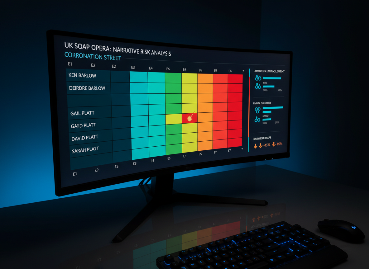
Narrative risk reports flag sensitive plots, backlash patterns and representation concerns, giving commissioners space to adjust stories before issues escalate.

Analysis

Newsletter

Weekly briefing on UK soap audiences, trends and risks.

A large, multi-monitor trading-desk-style setup displays different UK TV soaps, each screen dedicated to a separate series’ weekly audience intelligence overview. One monitor shows a regional heatmap of viewer engagement, another visualizes sentiment clouds around key storylines, and a third presents compact KPI widgets for loyalty, churn risk, and episode reach. The monitors rest on a sleek, brushed aluminum stand over a charcoal desk with an ultra-thin keyboard and a single, minimalist notepad with structured bullet points. Overhead, soft, neutral office lighting blends with the cool glow of the screens, creating layered reflections on the desktop. Photographic realism, wide shot with slight panoramic feel, professional and high-energy yet controlled mood, evoking a mission-control hub for UK soap analytics.

Contact team

Tell us about your brief or data questions and we’ll outline how UK soap audience insight can support your team.

← Back

Thank you for your response. ✨

Is this your new site? Log in to activate admin features and dismiss this message
Log In